Top 5 Neutral Paint Colours for 2022
4 min read
We often describe neutral paint colours as plain white, boring beige, or drab gray – colours that don’t enrich a space. This is no longer the case.
Over the last 20 years, I’ve learned that neutral paint colour can be the colour used in the largest proportion of a space. It doesn’t have to pop and draw attention to itself. Other hues in the room can do that. Neutral paint can add subtle energy to the colour scheme of a space. By looking at neutral paint in this way, any dominant paint colour needs to contribute to a space’s character, even if it’s subtle.
Gone are the days of non-colours – paint that is there to remove the look of bare drywall or plaster. Today’s neutral paint colours range from light to dark. They have undertones and add a “kiss of colour”. Neutral paint colours have more tone (gray-based) and saturation (deeper colour). They still blend into the background but they offer a rich flavour to any space. I like to think of these colours as the Umami (or fifth flavour sense) of a room.
Take a look at my top 5 neutral paint colours that you can use in your home today!
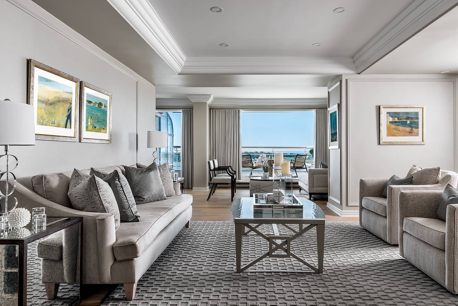
Jockey Hollow Gray (HC 108)

Don’t let the name fool you. Jockey Hollow Gray (HC 108) is not the gray we’ve seen online and popularized by modern farmhouse styles. This colour is a mid-tone – a grayish olivey green. Depending on the light source it can appear to vary drastically from very green to a beige-gray colour.
It’s warm and enveloping without being dark. In nature, it’s much like a white mist that has settled over a green farm field. Pair this with a dark, charcoal-coloured table and chair set. Add gold accents, complete with a mid-tone brown or light wood floor and layer it with any light-cream fabric. This will create a graceful, elegant, and timeless space.
Titanium (OC-49)

Classified as off-white, Titanium (OC-49) is neutral, tinted with a hint of the palest green. It’s still a white paint colour but the cast is towards a sea mist with a blue direction. It’s a wonderful option for any room where regular white just seems a little too predictable.
Combine this wall colour with brighter baseboards using Oxford White (CC-30). A golden wood floor such as natural oak (yes there are colours that look good with this!) with accessories in navy or coral provide a nice punch of colour. Titanium is a sophisticated wall choice colour. It’s not the norm but if you want to make an older, more orange-leaning floor look better, this is the way to go!
Dead Salmon (No. 28)
Not one to mince words, Farrow & Ball offers an entire palette of toned rich colours. Dead Salmon (No. 28) ties into today’s direction of ever so slightly pink-kissed neutrals. Although darker than an off-white, this pink-toned deep beige offers a warm hug on a cold day, even if yesterday’s salmon in the fridge has probably gone off!
Use Dead Salmon with deep brown floors and crisp white trim and baseboards. Select fabrics with burgundy, cream, and white with accents of black for a classic scheme. If this is just too much for you, consider it in a powder room where you should take a risk and treat yourself and your guests to something different.
See more examples of Benjamin Moore’s beige paint colours .
For a lighter greige option that has a slightly mauve-pink undertone, check out Benjamin Moore’s Mocha Cream (CC-458).
Down Pipe (No. 26)
For many, the depth of Down Pipe (No. 26) will challenge your notion of what a neutral paint colour can be. Down Pipe is dark but heavily saturated with gray which gives it a milky tone. It’s a deep gray with navy blue peeking through. The deep gray tone makes it very livable despite its depth and the milky quality ultimately makes a great background colour (or a neutral).
Use this hue in an office or bedroom to ground it, adding depth and comfort. Layer any lighter colour in front and watch the space come alive. Accent with any polished metal or matte black for more drama and enjoy the admiration your guests will show!
For Benjamin Moore options in gray, watch this short clip: Top 5 Benjamin Moore Grays!
Gray Owl (OC-52)

For the purists who prefer their neutral almost white, Gray Owl (OC-52) is one of the lightest colours but it’s not the brightest. Deeply toned with gray, it reads blue-green in some light conditions and gray in others. This paint colour is a perfect foil to liven up blonde floors with blah white walls.
If you have a room with walls that seem to always turn pinky regardless of the colour you paint due to light reflected from outside and that’s not the goal, consider this colour instead. It will read as gray, as its green undertone will cancel out the pink-mauve reflection. It’s also light enough to be paired with any colour, light or dark, making it a complex neutral with lots of possibilities!
Bonus neutral: Sail Cloth (OC-142)

Although beige has largely been out of favour for the last few years, Sail Cloth (OC-142) is exceptional with its warmth and stable colour balance between beige and a touch of gray.
For our clients who want something different, we paint trim with this warm greige colour and have found it quiet and gentle. Pair it with walls painted in Simply White (OC-117), add Sail Cloth on trim, baseboards and interior doors and it creates a grounded, calm feel, an ode to American Shaker or Historic Williamburg styles. Basically, it’s a colour that stands the test of time regardless of the trends.
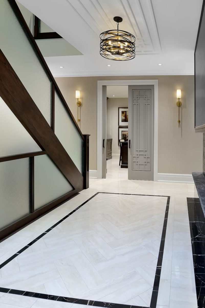
Sail Cloth was used for the trim in this hallway.


